Why Fitness?: Branding
Why Fitness? Branding
I was sent a client brief to create a logo and brand identity for the fitness brand Why Lift? Below I have put the pages from this brief.
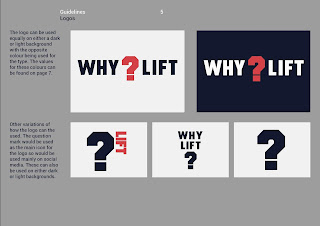
I started by doing some quick Pinterest research into other fitness related brands and the style which I liked the best was the Nike Track and Field campaign as I loved the simplicity of it. After different logo iterations I created a logo and brand guidelines which I was happy with and thought would work well. Below are the individual pages from the brand guidelines I created.
I sent this off to the client and overall they were happy with the design but it made them think into what their business actually was going to be and they decided to change the name to Why Fitness? but have sub-categories for each sector such as Why Lift? and Why Swim?. So I then went ahead and created logos for the list of sectors they provided.
However, by doing this we hit an obstacle; unless you know the name of the brand 'Why Fitness?' the square logo doesn't make sense on its own. So the next step was to look at how we can put the Why into this design so that it looks good and works.
These are the three different designs that I tried and the one that worked the best is the design on the left. I am currently waiting to hear back from the client on whether they are happy with this design or whether they want me to go back and explore more iterations.
Another thing the client wanted me to design was some t-shirts using the 'Why Fitness?' logo and another sector's logo, aswell as how I can encorporate the word 'Coach' into the design, below are the designs I came up with. I am also still waiting to hear back from the client about these designs aswell.


Comments
Post a Comment